Customization
Embedded Wallets includes a prebuilt UI for authentication and wallet management that you can tailor through the Embedded Wallets dashboard. Theme the sign-in modal to your brand, localize text for your audience, and fine-tune the user journey.
Access to certain customization features is gated by your pricing plan:
- Default sign-in UI: Base Plan
- Customization and whitelabeling of the sign-in UI: Growth Plan
- Embedded Wallet UI: Scale Plan
All features are available for free on Sapphire Devnet for testing.
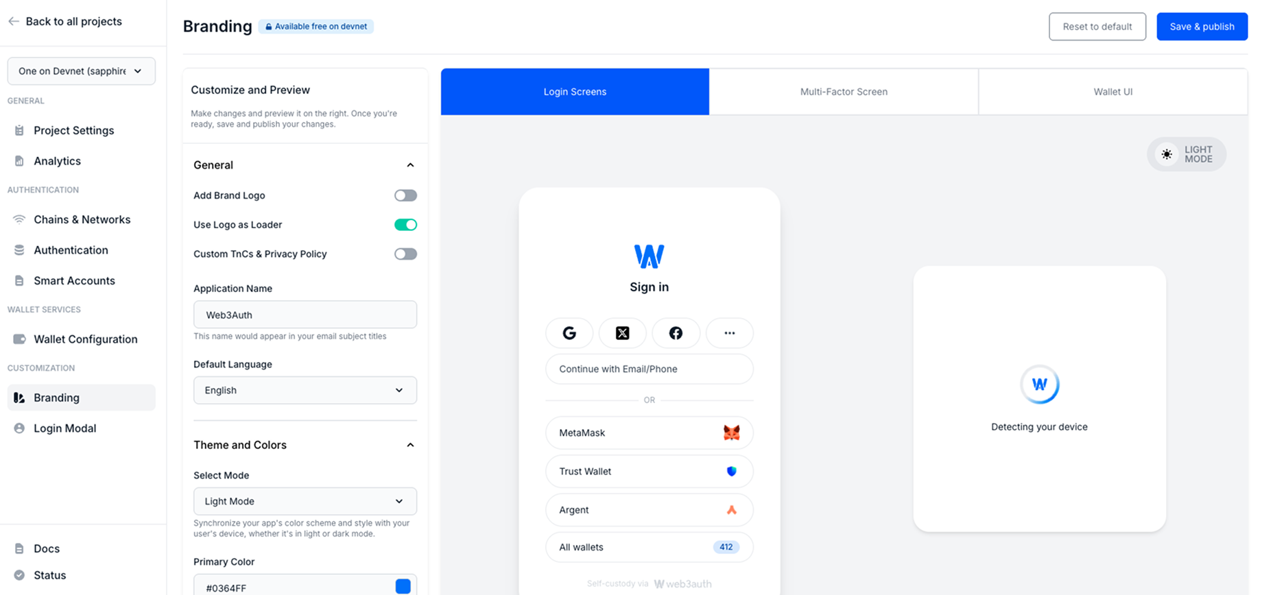
Branding
The Branding page under the Customization section of the Embedded Wallets dashboard allows you to personalize the visual identity of your dapp across multiple user interfaces. This includes the sign-in screens, multi-factor authentication (MFA) screens, wallet UI, and sign-in modals.
Effective branding ensures a seamless and recognizable user experience, helping users feel confident that they are interacting with your dapp, even when interacting with Embedded Wallets hosted interfaces.
All changes made within the branding page can be previewed in real time. However, to reflect updates in production, you must select the Save & Publish button after making changes.
You can customize the following:
Add brand logo
Upload a logo to personalize the user interface and email templates. For optimal performance and compatibility, we recommend using a PNG file. The logo appears across sign-in flows, wallet views, and email communications.
Use logo as loader
Display the uploaded logo as the loading spinner across the Embedded Wallets sign-in flow. This detail enhances brand consistency and gives users a familiar visual cue during authentication.
Custom terms of service and privacy policy
Link to your dapps's terms of service and privacy policy. These links will be displayed during user onboarding and consent flows, ensuring legal compliance and improving transparency.
Application name
Define a name to be used across system-generated communication, including the subject lines of email templates. Ensure that the application name clearly represents your project or organization.
Default language
Select the default language for all user-facing Embedded Wallets components. Supported languages include:
- English
- Japanese
- Korean
- German
- Mandarin
- Spanish
- French
- Portuguese
- Dutch
- Turkish
This setting ensures that your dapp's authentication flow is accessible and intuitive for users across different regions.
Locales are open source. Contribute or extend translations in the Embedded Wallets locales repository to include them in the next release.
Theme and colors
The Theme and Colors section allows you to synchronize the aesthetic of the Embedded Wallets interfaces with the branding and design system of your dapp.
Select mode
Choose between Light, Dark, or Auto mode. When Auto is selected, the interface adapts to the user's system theme preference automatically. This ensures a consistent and user-friendly visual experience, regardless of the device or OS settings.
Primary color
Define the primary brand color used across interactive elements such as:
- Buttons
- Hyperlinks
- Tab indicators
- Focus outlines
- Loaders and spinners
- Navigation tabs
On primary color
Specify the color applied to text and icons that appear on top of primary color backgrounds (such as button labels or iconography). This ensures sufficient contrast for readability and accessibility.
Choose color combinations that meet accessibility guidelines (such as WCAG) to provide an inclusive experience for all users.
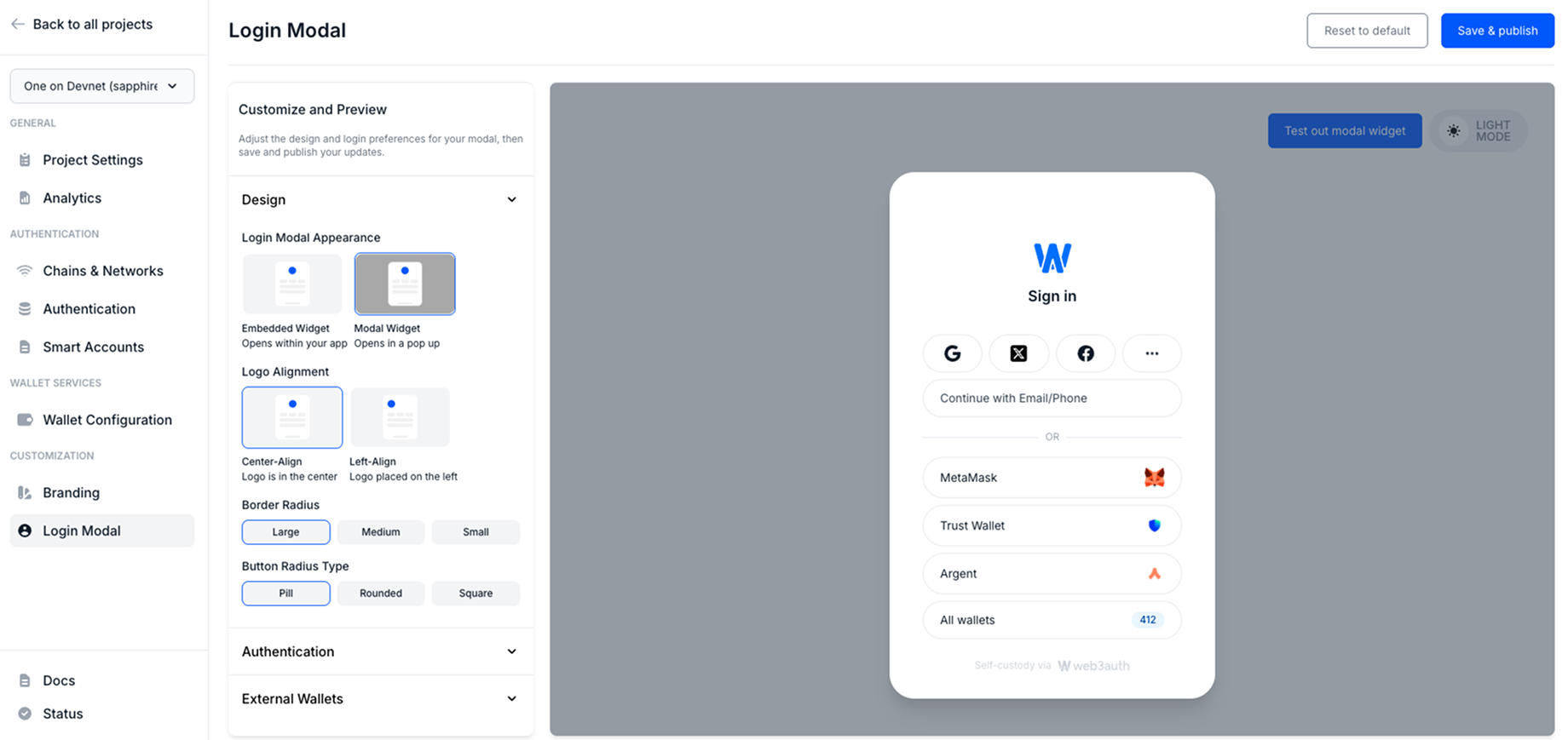
Sign-in modal
The Login Modal page under the Customization section of the dashboard provides you with granular control over the appearance and behavior of the Embedded Wallets sign-in flow.
You can customize the following:
Design
The Design section offers layout and styling options to customize how the sign-in modal is presented to users.
Sign-in modal appearance
Choose between two display modes for the sign-in interface:
- Embedded widget: The sign-in UI is embedded directly within the dapp's layout. This option is ideal for single-page dapps or flows that require a fully integrated experience.
- Modal widget: The sign-in interface opens as a pop-up modal overlay. This provides a more traditional web3 wallet experience, where authentication occurs in a floating layer over the existing content.
Logo alignment
Configure how the dapp logo is aligned within the sign-in modal:
- Center-aligned: Displays the logo at the top center, suitable for balanced layouts.
- Left-aligned: Positions the logo to the top-left, often preferred for enterprise or dashboard-style dapps.
Border radius
Adjust the corner curvature of the modal interface. Small, medium, or large radius options allow for stylistic variations that better match your dapp's design system.
Border radius type
Refine the shape of buttons and input fields within the modal by selecting:
- Pill: Fully rounded ends for a modern, soft appearance.
- Rounded: Gently curved corners for a subtle aesthetic.
- Square: Sharp 90° corners for a more technical or minimalist look.
These design customizations ensure the sign-in experience feels native to the dapp, enhancing user trust and engagement.
Authentication reorder
The Authentication section provides flexibility in how sign-in options are presented within the modal.
Arrange sign-in order
When multiple sign-in methods (such as social, email/phone, external wallets) are available, define the order in which these options appear:
- Drag and drop the sign-in methods to rearrange their position.
- Order determines the priority and placement of sign-in options shown to users during authentication.
This customization improves user experience by surfacing the most relevant sign-in methods first. For example, you can place a company-preferred SSO or social sign-in provider at the top.
External wallets
The External Wallets section let you configure how third-party wallets (like MetaMask or any wallet connected through WalletConnect) are displayed in your dapp.
Show installed external wallets
Automatically detect and display any compatible wallets already installed in the user's browser or device (like MetaMask). This improves onboarding by surfacing options users are already familiar with.
Select number of external wallets
Choose how many external wallet options are displayed at once. Limit or expand this list based on the target user base and the types of wallets they're likely to use.
These settings ensure wallet integrations are both comprehensive and context-aware, adapting to the environment and user preferences for seamless onboarding.
Headless mode
Prefer to skip the prebuilt UI entirely? Implement your own screens and flows while using the Embedded Wallets SDKs under the hood. Headless mode gives you full control over the UX while retaining authentication, key management, and wallet functionality.